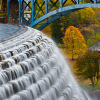
Colors, strong or weak, or the lack thereof, come from the light in our image and is one of the three core components of a beautiful photographic image. In the art of photography, we have both more and less control over the color in our images than some other visual arts. Chasing light and color are such core parts of photographer, as well, as the photographer travels or stubbornly returns to the same place again and again to find the exact hour of the exact day when the color she wants is there.
 Unlike some other visual arts, in photography we start with a common baseline, the actual color in the scene we are capturing. If we were a painting, designing in the computer, or sketching the limits are only what our imagination and skill would allow us to define. The colors we start with could be completely replaced, or a memory of fall could be merged with a memory of spring to create colors that never exist in nature. With photography, we have some capabilities in the digital darkroom to experiment and push, but are always starting from the same common ground.
 However, I would conversely argue that sometimes this can be an advantage as well. It strikes me in particular during this time of year, when the greens are more beautiful than any other time of year, the flowers on trees are just bursting with beauty, and even the blue sky seems to explode with color. The painters skill and experience will lead him or her down a path of finding just the right mix of pigments to try and match what nature has already put in front of us for our cameras to capture. Chemical or digital developing of the images, and the skill in that process, is still critical to the final product, but the photographer has the starting point color.
Of course, that color, like the light, can be fleeting and elusive. There are places near my home, studio, and office that I have photographed dozens and dozens of times looking and waiting for just that moment. Sometimes our persistence pays off, at other times it seems we never catch the exact moment we can see in our mind’s eye. And sometimes being in the right place at the right time, we get “lucky” … or make our own luck.
 What about the lack of color, and of shape? Josef Albers, “Shape is the enemy of color” and in many ways this is a good starting point. It helps explain the differences between a strong color and a strong black and white image. That said, the two can work together as complements if you are aware of each of their strengths, or if one is there to add accent/value to the other. In the image of the Guggenheim to the right, the shape is the driving element, but the contrasting colors add an extra element that a black and white conversion loses.
As anyone familiar with my photography may suspect, color is one of the strongest elements to have traditionally attracted me to a frame. I love to use it as a focal point, to bring contrast and attention to a detail, or to communicate a mood and feeling. The lack of color is another way to communicate a mood, feeling, or color, and to express the importance of the light and shape of the frame.


About The Author: Jeremy
More posts by jeremy